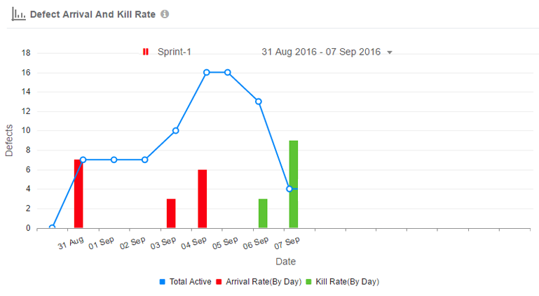
The Defect Arrival and Kill Rate chart shows the count of opened and killed defects by each day. This enable users to track the trends of defects attended in a specific time box.
The chart is useful to know the daily count for arrived and killed defects with its total active count. This will help tracking defects for the selected time box and thus tracking the quality.
1. Active Defects: All the defects which are not having the status closed.
2. Defect arrival rate: All the defects opened per day.
3. Defect Kill Rate: Defects killed per day.
X – Axis: Days of Sprint
Y – Axis: Number of Defects
Feature includes,
Count of Total Active, Arrival Rate (By Day) and Kill Rate.
View a count of non-closed defects in scope over time, color-coded by Bars and line chart.
Hover over a Bar or line to see the count of defects for that day.
The X-Axis show the number of defects arrived (Red Bar) and the number of defects closed (Green Bar) per day. The blue line represents the total active defects per day.
The chart shows the trend of arrival and killing of defects with its total active defects per day.

