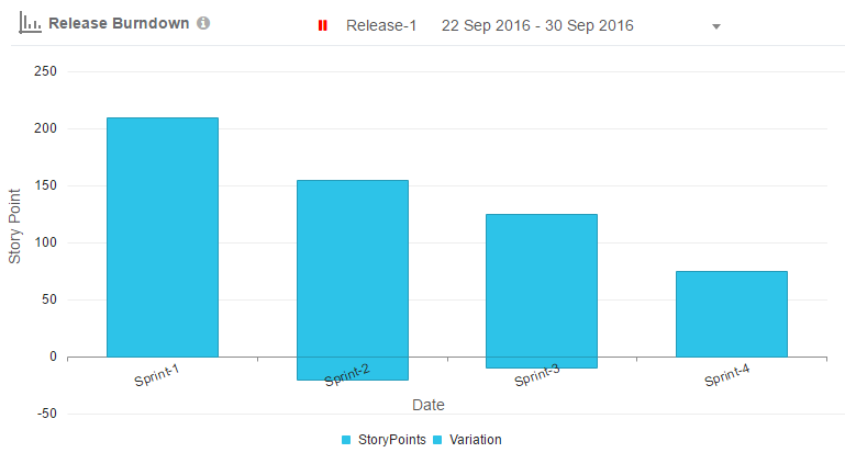
By reviewing the Release Burndown chart, one can understand how quickly the team has delivered backlog items and track how much work it must still perform to complete a product release. As work gets completed sprint-by-sprint for a release, the backlog tends to decrease. The Release Burndown chart tells how much work is still left to be done versus how much time is left.
X Axis – shows the range of date.
Y Axis – shows the total available hours of all the teams within a release (sum of all teams’ availability of all completed and active sprints).
Two lines available on the chart and both lines will go downwards, where grey line signifies Ideal Remaining Hours and the blue line signifies Actual Remaining Hours.
Ideal Remaining Hours shows the total number of hours that the teams are available at the beginning of the release. The line will descend as per as the working days pass on, in the release.
Ideal Hours present the team availability which will be deduced on each day. The user will view the burn down data of maximum 30 days of the release. Whereas, Actual Remaining Hours will reveal the total number of hours that the teams has burned on each day from all the completed and active sprints of active release. It will be calculated from the summation of remaining hours of all tasks from all completed and active sprints of an active release.

